Track 05: The Best Update Since 2008
Imagine Software ITA: Redesigning a medical billing tool that CSMs use on every call.
CompanyImagineSoftware
RoleSr. Product Designer, Solo
Timeline2 weeks
ToolsFigma, Miro
Project Overview

ImagineSoftware is an automated medical billing and revenue cycle management platform used by healthcare organizations across the US. Their internal Client Details screen — part of the Internal Ticket Application (ITA) — is the primary tool Customer Success Managers use during live calls with medical clients to pull account information, verify credentials, and resolve billing issues in real time.

By 2020, the tool hadn't been meaningfully updated since 2008. As Imagine approached their 20th anniversary, the decision was made to redesign the experience. I was brought in as the sole designer with two weeks to research, design, iterate, and ship.

Why it mattered: CSMs are on live calls with medical billing clients when they use this tool. Every second of confusion — a missing focal point, buried navigation, content overload — directly affects a customer's experience with their healthcare billing. This wasn't an internal productivity problem in isolation. It was a patient-adjacent service problem.

The Challenge

The existing ITA had not been meaningfully updated since 2008. Customer Success Manager complaints had reached a tipping point, and a full redesign was prioritized for the 20th anniversary release. I was the only designer on the project with a hard two-week deadline.

My goals going in:

Speed
Make it fast and easy to complete tasks without exiting the screen mid-call
Clarity
Simplify and visually modernize an interface that hadn't evolved in over a decade
Structure
Reorganize the information architecture around what CSMs actually need first
Constraint
Two weeks, one designer, a hard ship date tied to a major company milestone
The Problem

Before designing anything, I observed and interviewed 5 Customer Success Managers across Tier 1, 2, and 3 levels — watching them use the tool during real workflows before asking them to describe their frustrations. This is what I found.

No focal point
Too many competing elements. CSMs couldn't scan the screen quickly during a live call
Content overload
Multiple headers, numerous dropdowns, and dense field layouts created unsustainable cognitive load
Broken task flow
The system required CSMs to exit the current screen to complete basic actions, breaking their workflow mid-call
Navigation failure
CSMs weren't sure where to click. Quick access to critical information was nearly impossible
Dated interface
Visually the tool communicated that it hadn't kept pace with the organization. New users faced a steep learning curve
Design Approach

Two weeks, one designer, zero room for guessing. The process had to be tight.

01
Week 1 — Research
Wrote interview scripts, conducted usability testing and direct observation sessions with 5 CSMs across all three tiers, compiled and synthesized findings, and identified patterns. The goal was to understand behavior, not just collect complaints.
02
Week 2 — Design and delivery
Sketched initial concepts, ran four rounds of iteration with CSM feedback driving each pivot, refined the final design, and shipped. Every iteration decision was tied directly to something a user said or did during observation.
The Before

The existing interface had not been redesigned since 2008. Content overload, no visual hierarchy, and a navigation system that gave CSMs no orientation during high-stakes calls.

Original ITA interface — cluttered, outdated, no hierarchy

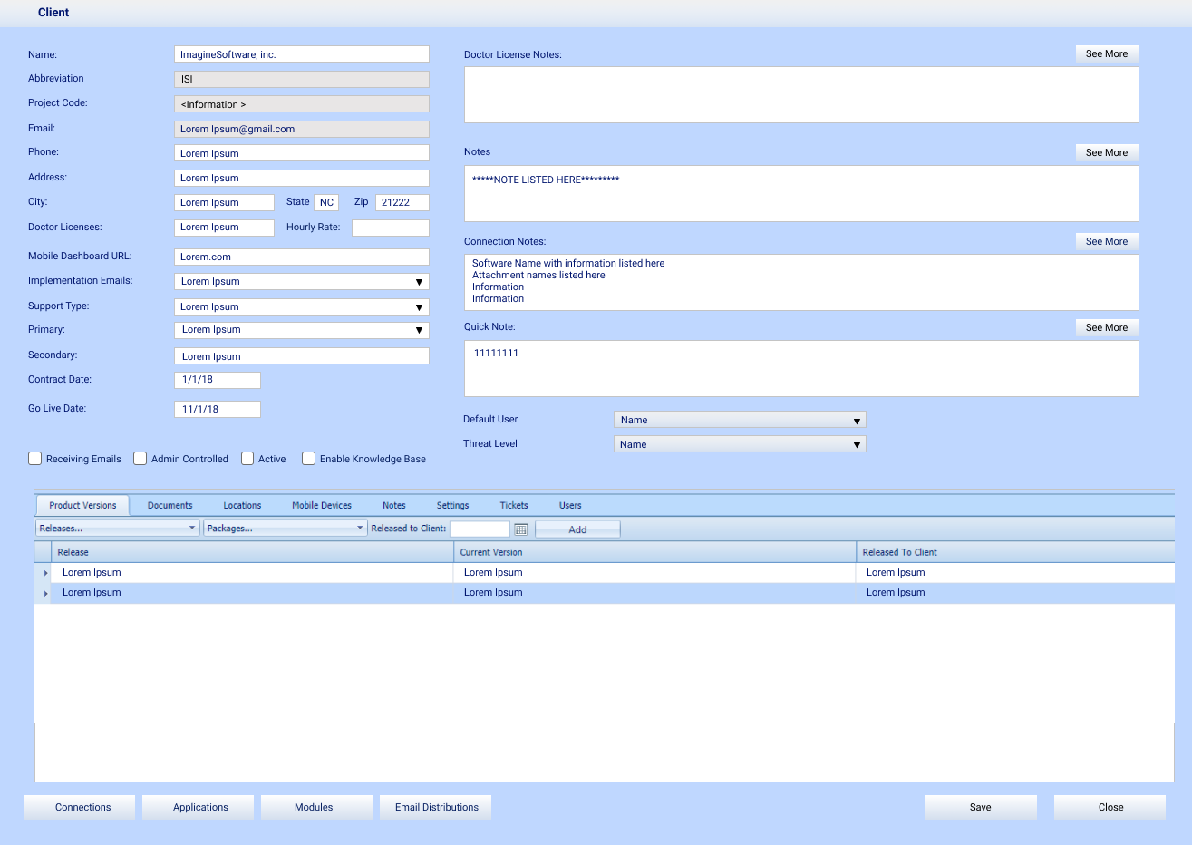
Original ITA — the experience CSMs were working with daily

The Iteration Story

The first two iterations focused on rearranging the existing layout. Both still read as outdated — no balance, no hierarchy. The information was reorganized but the experience hadn't fundamentally changed.

First two iterations — rearranged but still outdated

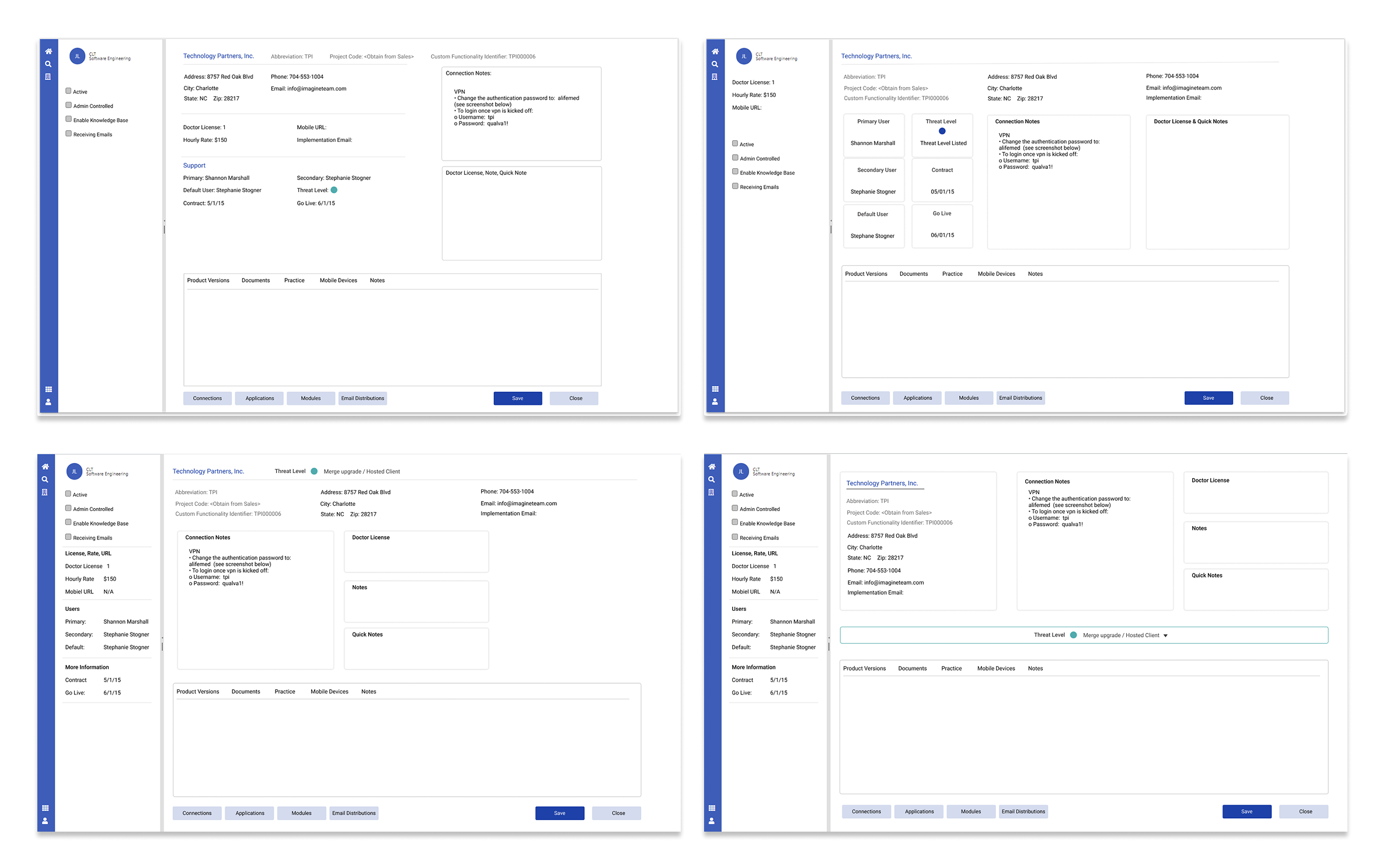
Iterations 1 & 2 — rearranging content without solving the hierarchy problem

The third and fourth iterations introduced a collapsible left navigation. CSMs responded positively but flagged that the bottom section still carried too much information. The fourth iteration — which surfaced threat level as the primary focal point — became the high contender.

3rd and 4th iterations — navigation introduced, threat level surfaced

Iterations 3 & 4 — navigation introduced, threat level beginning to surface as focal point

The high contender — threat level surfaced at top

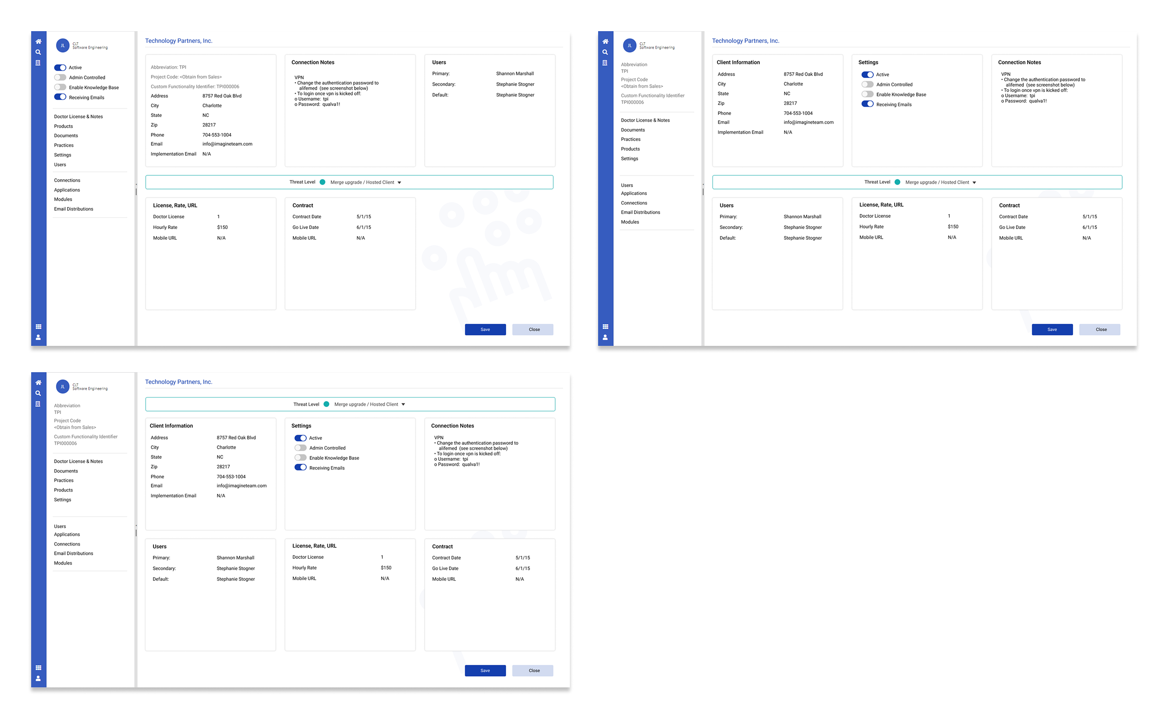
The high contender — threat level as focal point, navigation defined, tasks completable on screen

The Final Design

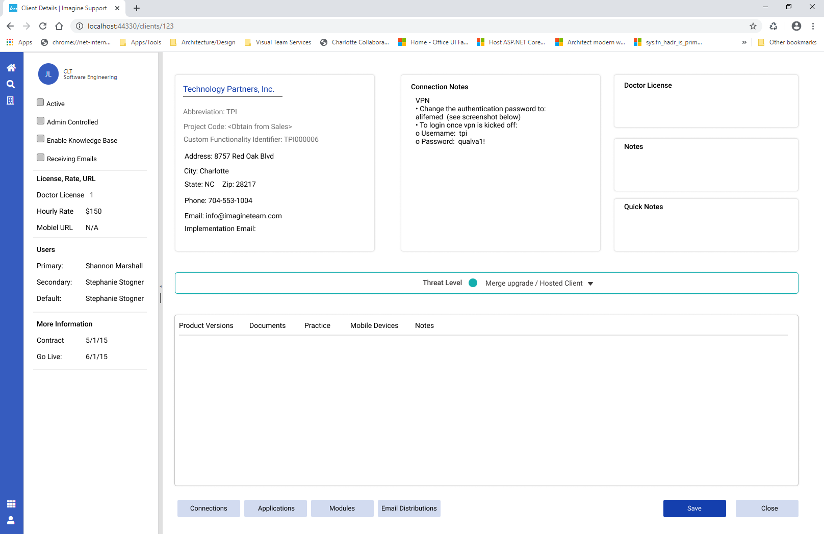
The shipped design resolved every core problem identified in research. Four improvements drove the outcome.

Navigation
A consistent, collapsable left navigation giving CSMs clear orientation and quick access for the first time
Focal point
Threat level surfaced at the top of the screen — the most critical input for determining how to handle a call
Productivity
All primary tasks now completable within a single screen. No more exiting mid-call
Contemporary design
White space, clear hierarchy, and a modern layout that matched where the organization was headed
Final redesigned ITA client details screen

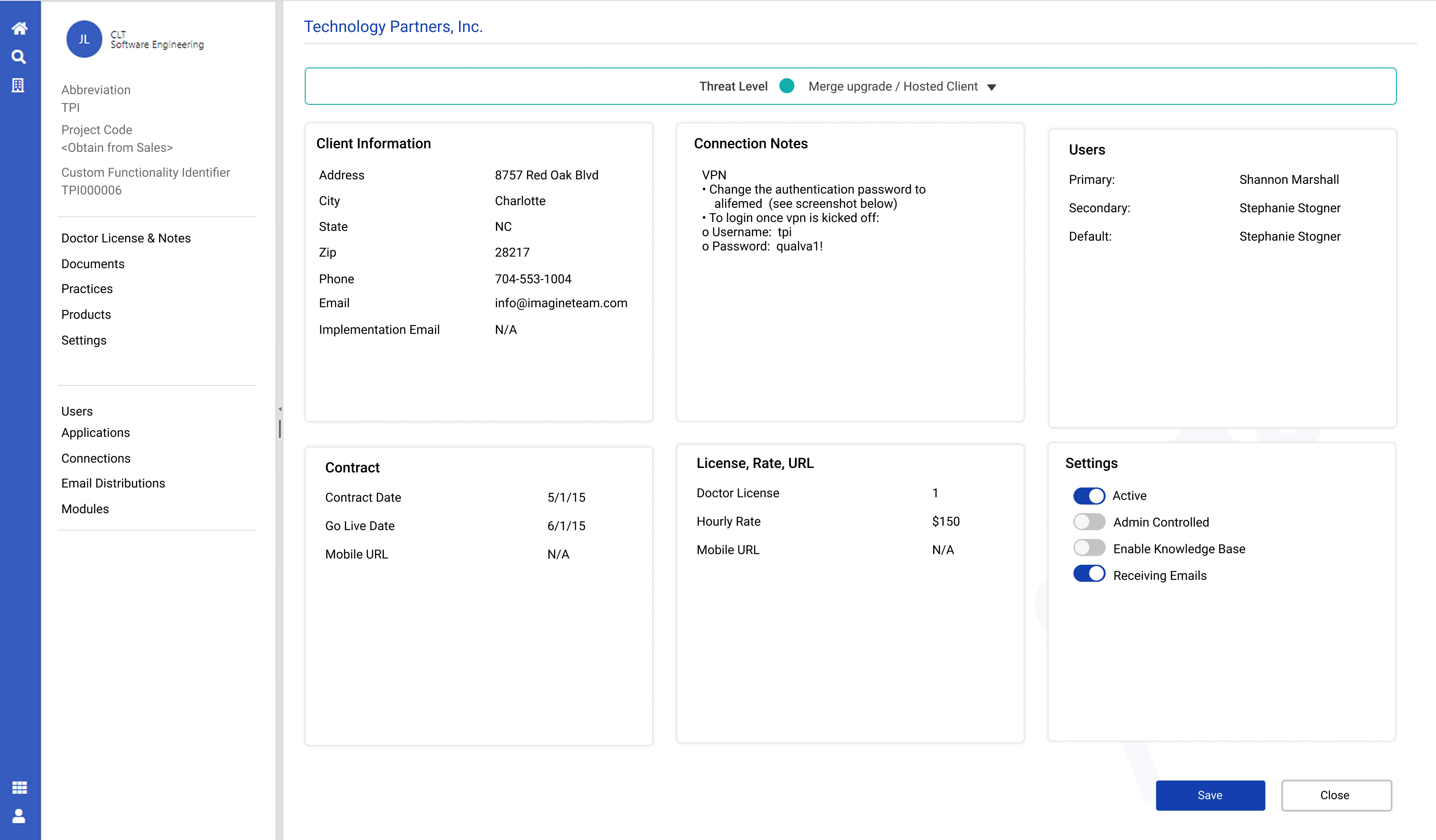
Final shipped design — March 2020, Imagine 20th anniversary release

User feedback on the final design

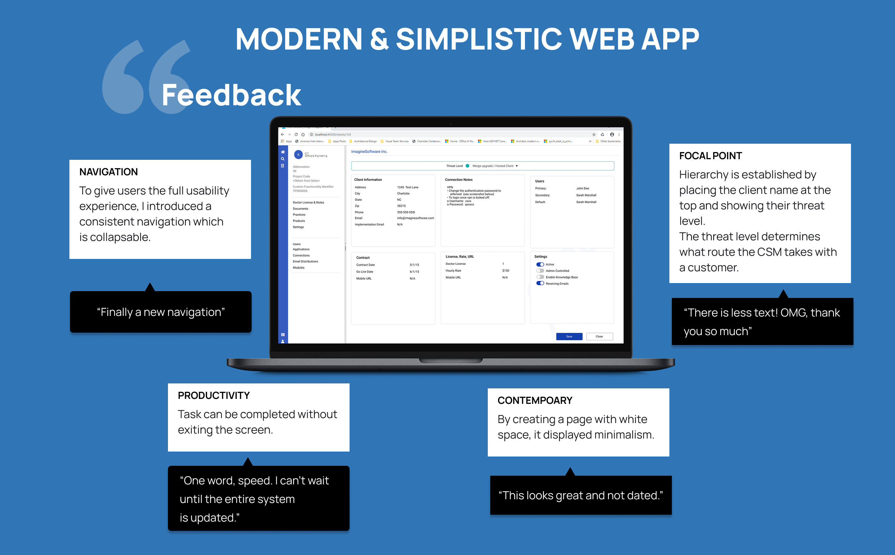
CSM feedback collected at delivery

Outcomes

User feedback at delivery was immediate and unambiguous. These are direct quotes from CSMs at first use.

"Finally a new navigation."
"There is less text. OMG, thank you so much."
"One word, speed. I can't wait until the entire system is updated."
"This looks great and not dated."
Task completion
CSMs could complete client lookups and resolve issues without exiting the screen for the first time
Navigation clarity
Confusion about where to click dropped immediately — the collapsable nav gave users orientation they had never had
New user onboarding
Clearer visual hierarchy made the learning curve measurably shorter for new CSMs joining the team
Anniversary release
Shipped on time as a centerpiece of Imagine's 20th anniversary product update in March 2020
Reflection

Two weeks is borrowed time. What made this work was getting in front of real users on day one — not guessing at pain points but watching them use the tool live. The research surfaced the threat level hierarchy problem immediately. Without that observation I likely would have spent both weeks rearranging content that wasn't solving the right problem.

Designing for people who support medical billing clients reinforced something I carry into every complex system project: clarity at the interface level has consequences that extend beyond the screen. A CSM who can't find what they need in three seconds is a patient who waits longer for answers.

If I had more time
Full platform scope
Applied the same research and hierarchy approach to the remaining ITA screens beyond client details
Design system
Built a component library to support consistent rollout across the entire platform
Post-launch measurement
Established a feedback loop with CSMs to measure task completion rate and time-on-screen improvements