Course Management
Redesigned Poll Everywhere’s LMS experience to better support professors syncing rosters, managing courses, and grading participation. I led research, user journey mapping, and high-fidelity design while collaborating cross-functionally. The redesign aligned with academic workflows and boosted engagement by 30%.
Role
Senior Product Designer
Tools
Figma, Lysnna, Asana, Notion
Duration
11 months
Project Overview
Instructors using Poll Everywhere were struggling to manage and reuse content across recurring classes or events. Every session required setting up new presentations when using the same materials and it resulted in a cluttered dashboard, duplicated work, and inconsistent naming conventions.
I led the end to end design of the Course Management feature to better support professors syncing rosters, managing courses, and grading participation. I led research, user journey mapping, and high-fidelity design while collaborating cross-functionally. The redesign aligned with academic workflows and boosted engagement by 30%.
Problem
Poll Everywhere’s LMS integration was built for corporate users, not classrooms.
Professors were frustrated by:
Confusing navigation that buried courses within participant pages
Roster syncing and grading workflows that were unintuitive
Technical limitations that made simple fixes impossible
We needed more than a visual refresh. We needed a system that reflected how educators teach, organize, and evaluate.
Old User Experience
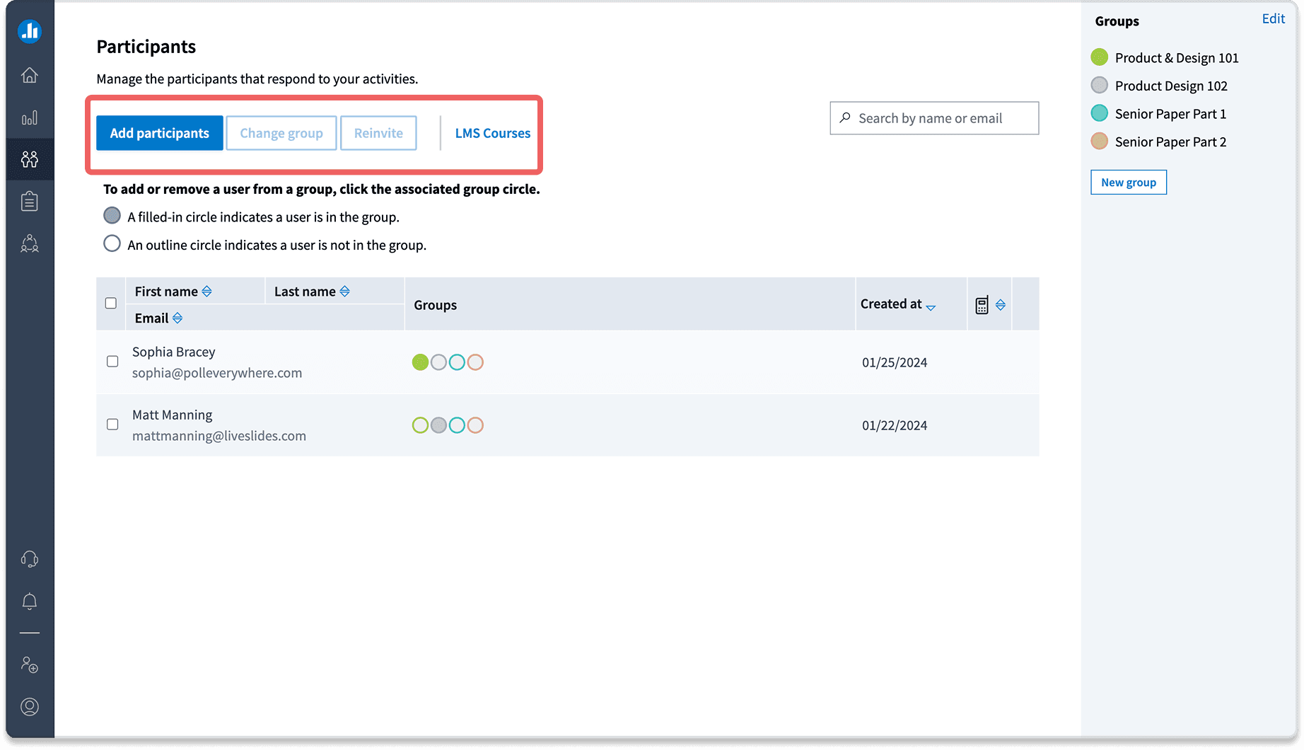
Participants Page
Lack of clear hierarchy; the screen feels cluttered
“LMS Courses” should be the primary focus, but “Add participants” is currently drawing attention.
LMS Courses & Gradebook
Users cannot disable roster sync.
No clear way to navigate back—breadcrumb is present but not clickable.
Inside the course/grade book, users can add a new gradebook but it opens a new window.

Objectives & Goals
Improve usability by aligning navigation with professors’ mental models
Simplify LMS integration, especially for syncing rosters and grading
Drive adoption by increasing semesterly active users by 10% YoY
How Might We…
How might we give customers something to look forward to?
How might we improve the navigation quickly without creating a new navigation page due to time lines?
How do we allow professors to quickly enable sync rosters,
enable/disable syncs, and grade participation?How do ensure professors are able to easily sync
their grade to their LMS?
These questions shaped every design decision and helped to balance tight timelines with long-term impact.
User Research & Discovery
I partnered with the PM and Design Manager to conduct 10–15 interviews with professors and admins. Instead of just collecting feedback, we observed workflows, surfaced frustrations, and listened to how users wanted the system to improve.
We validated concepts early with honest feedback, even when it meant pivoting. These insights grounded our direction in real educator needs while meeting business goals.
Key Findings

Constraints
Business Constraints:
Leadership was initially against adding a new navigation item. I secured buy-in through phased implementation as scope expanded.
Technical Constraints:
The outdated codebase limited what we could modify. I proposed a folder tree structure that was ultimately too complex, so I pivoted. Collaborating closely with Engineering, I helped redesign the experience to maintain usability within technical boundaries.
Initial Folder Tree Structure

MVP vs MSP: How the Project Evolved
MVP:Focused solely on roster sync without a standalone page
MSP: Scope expanded to include additional functionality, requiring a dedicated interface
MVP Design

Cross Functional Collaboration & Scope Cut
I worked closely with the Product Manager to balance business goals and user needs. Together with Engineering, we ran working sessions to align quickly and adapt design direction.
In one of these sessions, we ideated ways to simplify the folder tree without disrupting the current system. I conducted research on the platform’s breadcrumb behavior and realized that a deeper folder structure (four or more levels) was needed to trigger visibility.
Folder Tree Solution
I proposed a revised approach using a breadcrumb-based model that allowed users to view activity summaries on the same screen. This reduced friction while staying within technical limitations.
Courses in Production
Design Solution
New Course Navigation Structure
Introduced a persistent course banner displaying course name & LMS connection status.
Added a clear, left-side navigation for better discoverability.
Enabled quick access to participant management & grade books.
Before & After

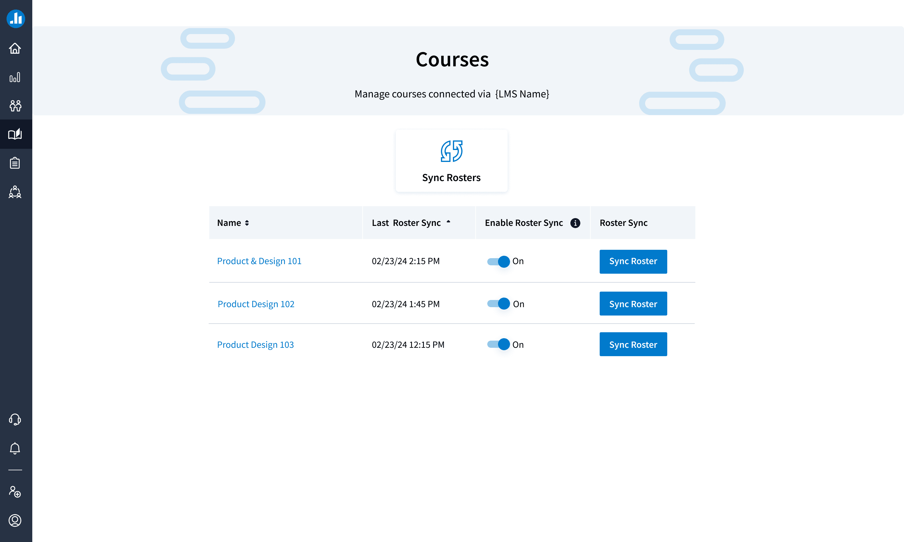
Roster Sync Controls
Added an enable/disable toggle so professors could manually manage syncing
Included confirmation dialogs to reduce accidental overrides
Implemented breadcrumb navigation to help users stay in flow and return to previous steps easily


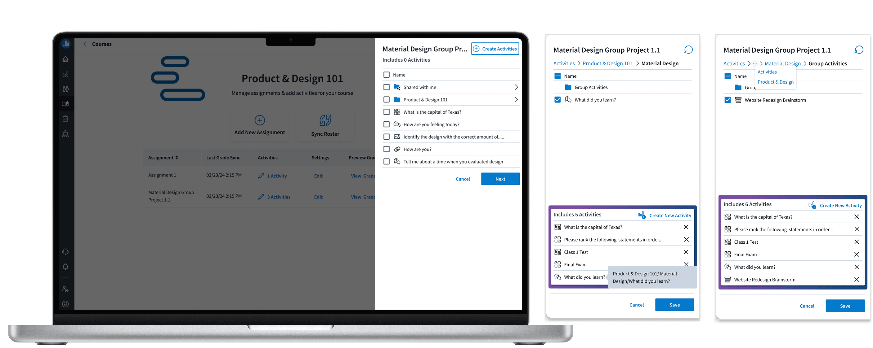
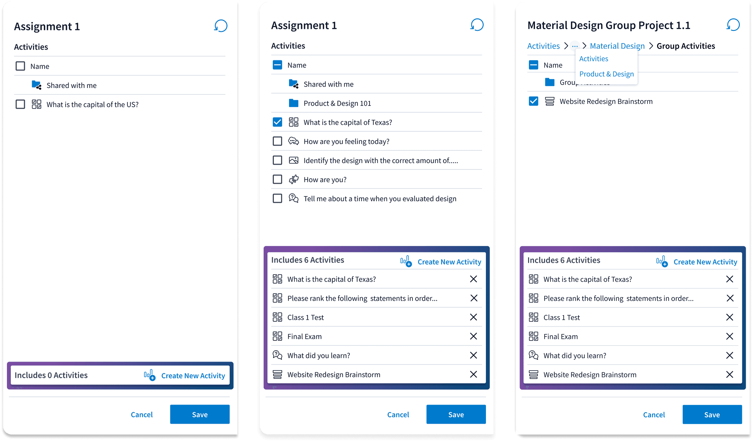
Add Assignment Fly Out
Professors can now name assignments and toggle settings such as participation and correctness points.


Add Activity Fly Out
Enables professors to complete quick actions directly within the window, such as creating an activity and adding or removing activities.
This feature allows them to efficiently manage their course content without navigating away from the page.
This was crucial for streamlining workflows and reducing the number of clicks needed to manage activities.
Smoother Workflow Transitions
Redesigned the grade book addition process, allowing users to stay within their current workflow.
Implemented breadcrumb navigation, making it easier to return to previous steps.
Participation Gradebook
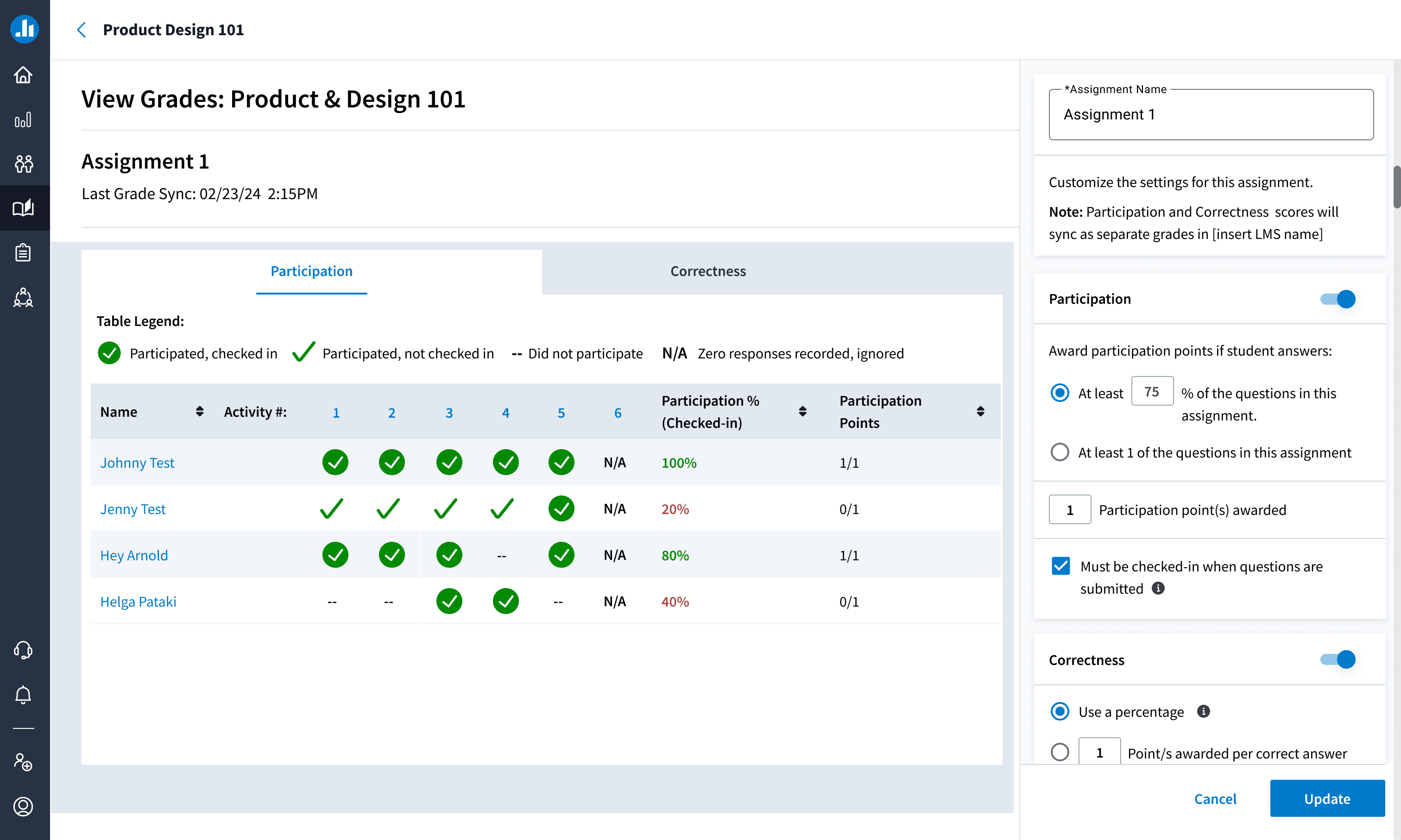
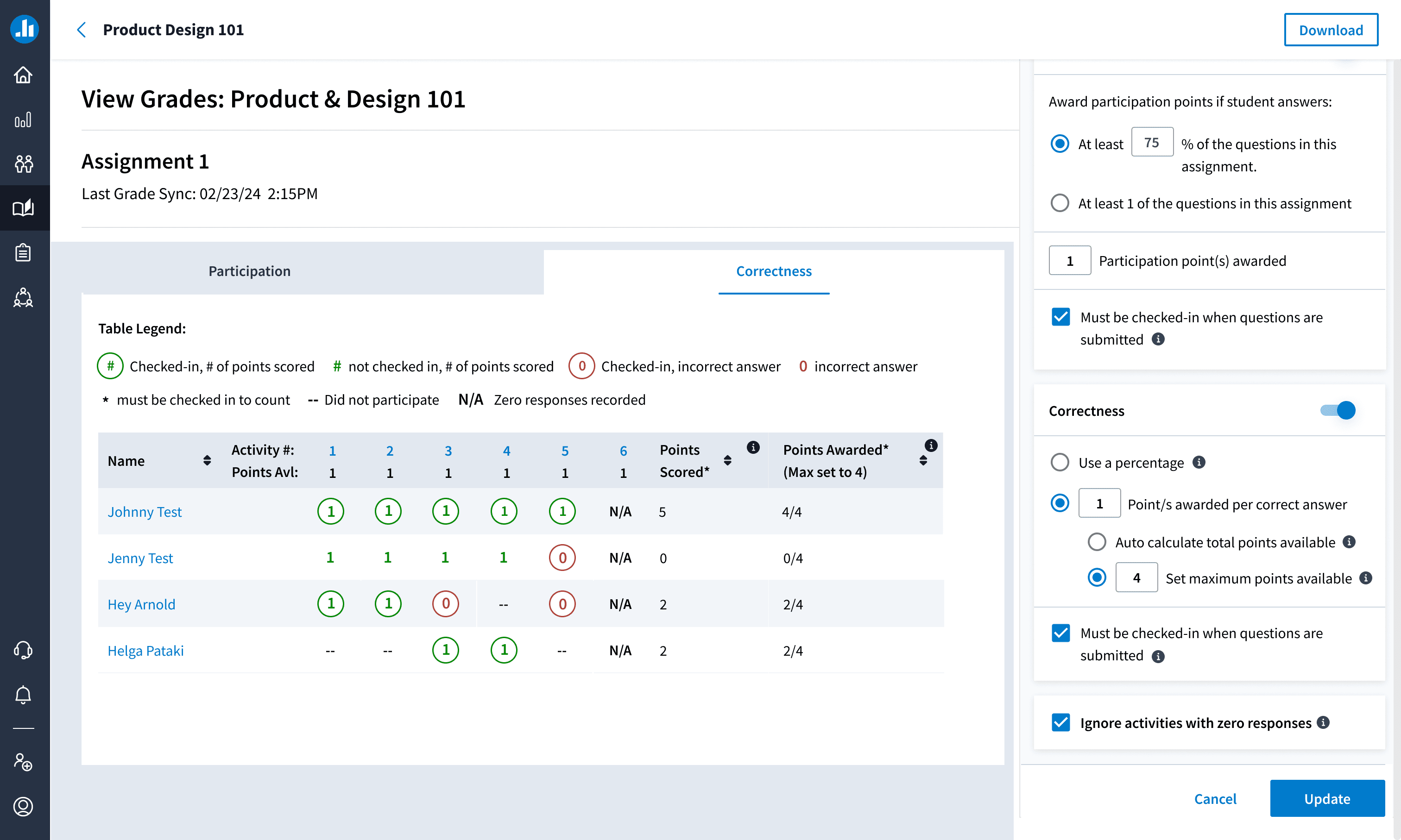
Correctness
Banners
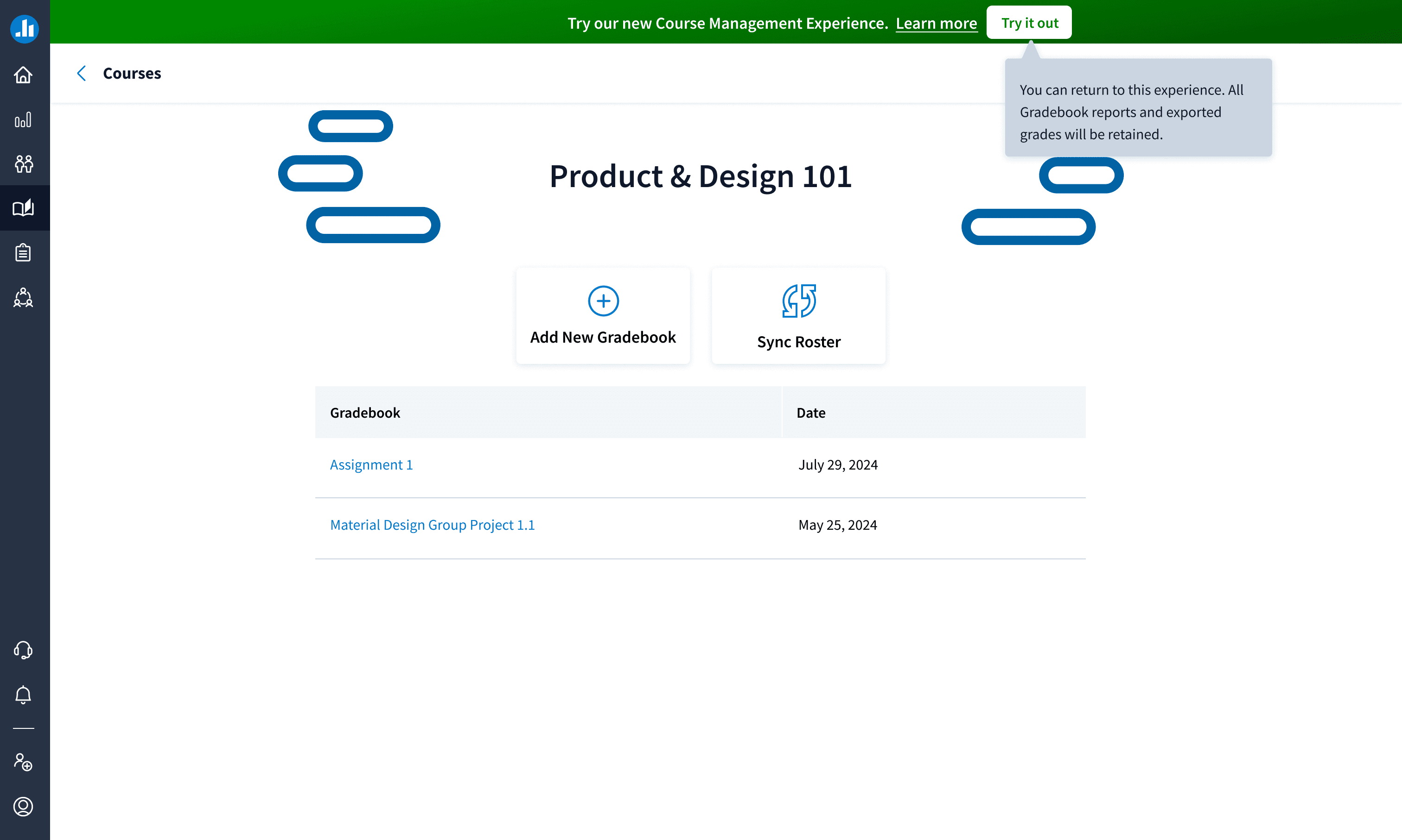
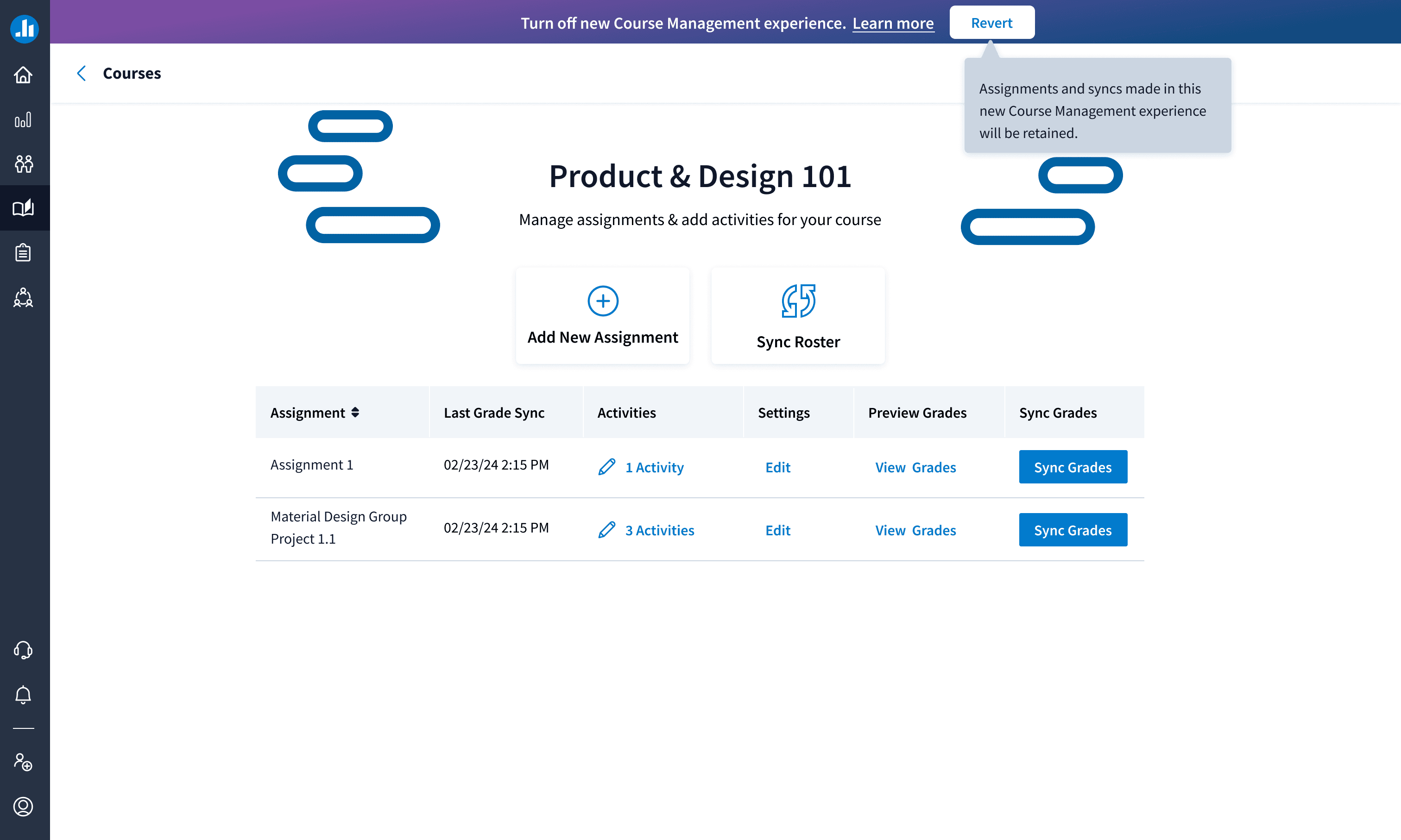
I implemented banners to let users opt into the new UI while keeping the old version available.
Although both experiences appeared similar, the table view offered all requested features. I considered using a toggle but chose descriptive text instead to clearly indicate which version the user was viewing.
Before & After
Outcomes
Navigation restructured to reflect how professors think about classes
Roster sync and grading redesigned to be efficient and transparent
Visual and interaction patterns updated for clarity
Impact
30% increase in user efficiency/engagement
40% faster user workflow
15% growth in new bookings
Reduced support tickets
Higher adoption rates
Conclusion
This project highlighted how strategic UX research, iterative design, and cross-functional collaboration can transform a complex system into a seamless experience. By aligning the interface with professors’ mental models, we created a solution that drives adoption, improves efficiency, and enhances satisfaction.
I received great feedback, including one stakeholder noting, "The new grade book looks slick," and my manager saying, "You killed it." This reinforced the impact of the work and the value of investing in user-centered design.
Course Management
Redesigned Poll Everywhere’s LMS experience to better support professors syncing rosters, managing courses, and grading participation. I led research, user journey mapping, and high-fidelity design while collaborating cross-functionally. The redesign aligned with academic workflows and boosted engagement by 30%.
Role
Senior Product Designer
Tools
Figma, Lysnna, Asana, Notion
Duration
11 months
Project Overview
Instructors using Poll Everywhere were struggling to manage and reuse content across recurring classes or events. Every session required setting up new presentations when using the same materials and it resulted in a cluttered dashboard, duplicated work, and inconsistent naming conventions.
I led the end to end design of the Course Management feature to better support professors syncing rosters, managing courses, and grading participation. I led research, user journey mapping, and high-fidelity design while collaborating cross-functionally. The redesign aligned with academic workflows and boosted engagement by 30%.
Problem
Poll Everywhere’s LMS integration was built for corporate users, not classrooms.
Professors were frustrated by:
Confusing navigation that buried courses within participant pages
Roster syncing and grading workflows that were unintuitive
Technical limitations that made simple fixes impossible
We needed more than a visual refresh. We needed a system that reflected how educators teach, organize, and evaluate.
Old User Experience
Participants Page
Lack of clear hierarchy; the screen feels cluttered
“LMS Courses” should be the primary focus, but “Add participants” is currently drawing attention.
LMS Courses & Gradebook
Users cannot disable roster sync.
No clear way to navigate back—breadcrumb is present but not clickable.
Inside the course/grade book, users can add a new gradebook but it opens a new window.
Objectives & Goals
Improve usability by aligning navigation with professors’ mental models
Simplify LMS integration, especially for syncing rosters and grading
Drive adoption by increasing semesterly active users by 10% YoY
How Might We…
How might we give customers something to look forward to?
How might we improve the navigation quickly without creating a new navigation page due to time lines?
How do we allow professors to quickly enable sync rosters,
enable/disable syncs, and grade participation?How do ensure professors are able to easily sync
their grade to their LMS?
These questions shaped every design decision and helped to balance tight timelines with long-term impact.
User Research & Discovery
I partnered with the PM and Design Manager to conduct 10–15 interviews with professors and admins. Instead of just collecting feedback, we observed workflows, surfaced frustrations, and listened to how users wanted the system to improve.
We validated concepts early with honest feedback, even when it meant pivoting. These insights grounded our direction in real educator needs while meeting business goals.
Key Findings
Constraints
Business Constraints:
Leadership was initially against adding a new navigation item. I secured buy-in through phased implementation as scope expanded.
Technical Constraints:
The outdated codebase limited what we could modify. I proposed a folder tree structure that was ultimately too complex, so I pivoted. Collaborating closely with Engineering, I helped redesign the experience to maintain usability within technical boundaries.
Initial Folder Tree Structure
MVP vs MSP: How the Project Evolved
MVP:Focused solely on roster sync without a standalone page
MSP: Scope expanded to include additional functionality, requiring a dedicated interface
MVP Design
Cross Functional Collaboration & Scope Cut
I worked closely with the Product Manager to balance business goals and user needs. Together with Engineering, we ran working sessions to align quickly and adapt design direction.
In one of these sessions, we ideated ways to simplify the folder tree without disrupting the current system. I conducted research on the platform’s breadcrumb behavior and realized that a deeper folder structure (four or more levels) was needed to trigger visibility.
Folder Tree Solution
I proposed a revised approach using a breadcrumb-based model that allowed users to view activity summaries on the same screen. This reduced friction while staying within technical limitations.
Courses in Production
Design Solution
New Course Navigation Structure
Introduced a persistent course banner displaying course name & LMS connection status.
Added a clear, left-side navigation for better discoverability.
Enabled quick access to participant management & grade books.
Before & After
Roster Sync Controls
Added an enable/disable toggle so professors could manually manage syncing
Included confirmation dialogs to reduce accidental overrides
Implemented breadcrumb navigation to help users stay in flow and return to previous steps easily
Add Assignment Fly Out
Professors can now name assignments and toggle settings such as participation and correctness points.
Add Activity Fly Out
Enables professors to complete quick actions directly within the window, such as creating an activity and adding or removing activities.
This feature allows them to efficiently manage their course content without navigating away from the page.
This was crucial for streamlining workflows and reducing the number of clicks needed to manage activities.
Smoother Workflow Transitions
Redesigned the grade book addition process, allowing users to stay within their current workflow.
Implemented breadcrumb navigation, making it easier to return to previous steps.
Participation Gradebook
Correctness
Banners
I implemented banners to let users opt into the new UI while keeping the old version available.
Although both experiences appeared similar, the table view offered all requested features. I considered using a toggle but chose descriptive text instead to clearly indicate which version the user was viewing.
Before & After
Outcomes
Navigation restructured to reflect how professors think about classes
Roster sync and grading redesigned to be efficient and transparent
Visual and interaction patterns updated for clarity
Impact
30% increase in user efficiency/engagement
40% faster user workflow
15% growth in new bookings
Reduced support tickets
Higher adoption rates
Conclusion
This project highlighted how strategic UX research, iterative design, and cross-functional collaboration can transform a complex system into a seamless experience. By aligning the interface with professors’ mental models, we created a solution that drives adoption, improves efficiency, and enhances satisfaction.
I received great feedback, including one stakeholder noting, "The new grade book looks slick," and my manager saying, "You killed it." This reinforced the impact of the work and the value of investing in user-centered design.
More Work

More Work

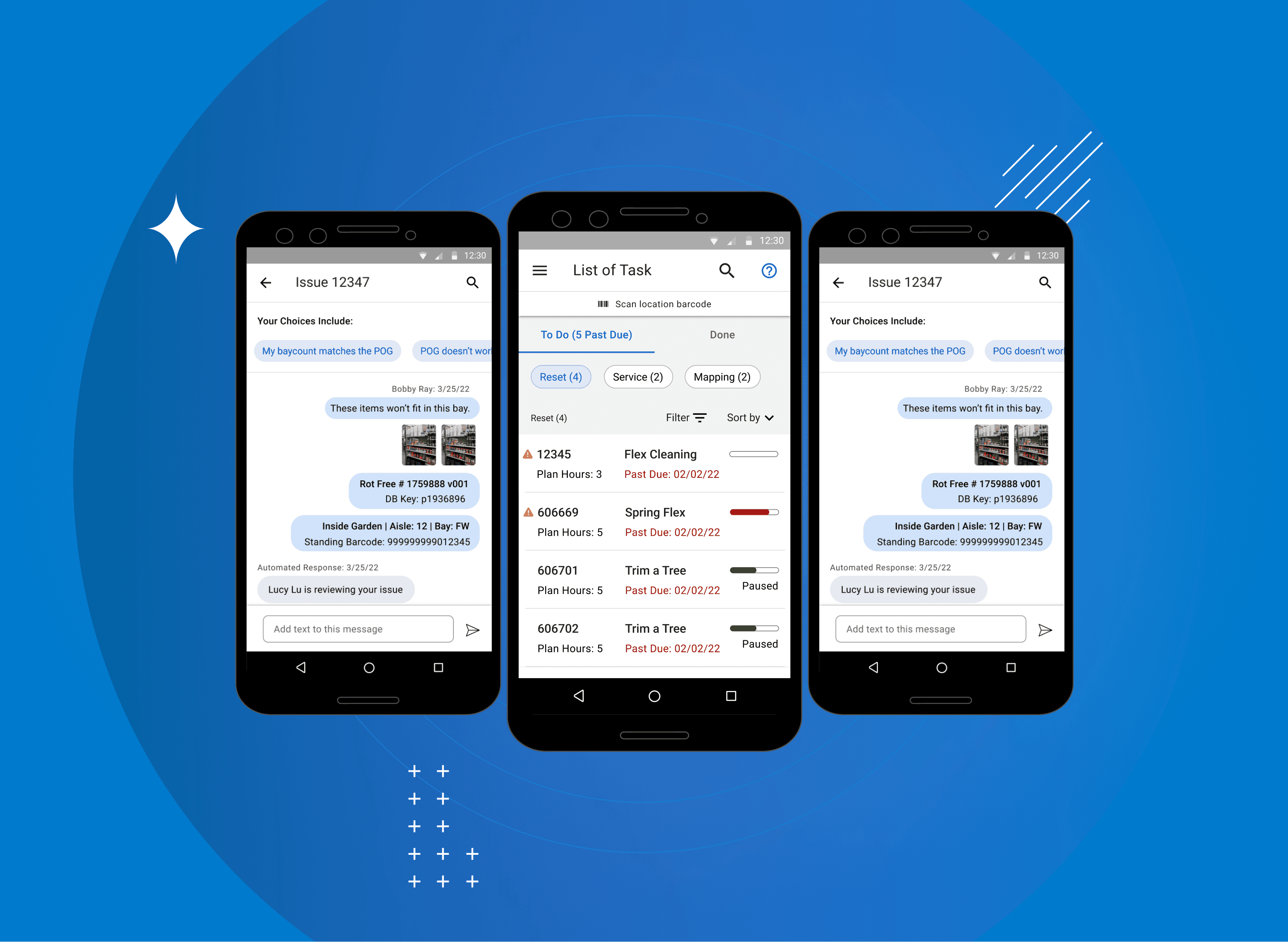
Lowe's MST App
Content
Role
Product Designer
Tools
Sketch, Invision, Miro
Duration
4 months